12.16.2011

Maria Wojdat

Open (acid yellow)


Rounded (Sequence red to yellow)


Colour Lines

Maria Wojdat's work explores color, line and form, and the relationship between spontaneity and control.  She received her bachelors in arts with honors in Graphic Design at the University of West England and her masters in Ceramic Design at Bath Spa University College in 2007, and since her work has popped up in many shows and publications. I wish I could see the bottom of just one of these, and I am curious as to whether they are heavy or not. These pieces are solid earthenware, with colored engobes sealed with wax. 

http://www.mariawojdat.co.uk/index.html

Taizo Kuroda

No. 8
No. 14
No. 21
 No. 22
No. 23


Japanese artist Taizo Kuroda's 'pure white' porcelain works are beautiful, and reflect his search for truth. In Japan, pottery is the most highly regarded of the arts. He uses fine grain sand paper to make his works smooth, and burnishes them, but does not use a glaze. This creates an eggshell like surface that is aesthetically pleasing, and I imagine the tactile experience would be marvelous as well. These forms are lovely, well balanced, and so incredibly thin, contrasting in No. 22 with the heavy foot. These works are all functional, but have a sculptural feel to them as well. Because of the incredible stylistic difference between them you couldn't tell by looking at his work that he has trained under the master Tatsuzo Shimaoka. I found this beautiful quote on his website: "A shape derives from the moment formlessness encounters form." 

http://www.taizo-kuroda.com/profile.htm

Ron Nagle


Ron Nagle, The Mingler, 2003
Porcelain and glaze
3 2/3 x 5 1/2 inches
Courtesy Garth Clark Gallery
 Ron Nagle, The Third Half, 2001
Earthenware
6 x 6 1/2 inches
Courtesy Garth Clark Gallery

Ron Nagle was born in San Fransisco, California in 1939. These works are very masculine, even seductive, and the control he had over the clay is incredible and flawless. As the geometry and form of these works are fascinating, the glazes he uses are what is most fascinating to me. Space is broken up by line and changes value, overarching form. He invests himself in these small works, and claims that they are more influenced by painting. 

http://www.artlies.org/article.php?id=1424&issue=52&s=1

12.15.2011

Kjell Rylander

‘untitled’, 2007 (photo janne höglund)

‘circle’, 2000 (photo annci gustafsson)
‘untitled’, 2001 photo (janne höglund)
 ‘resistance’, 2001
 Akershus Kunstnercenter 2003
 
 Kjell Rylander, born in1964, also distorts the function of traditional ceramic work. I find this so captivating! He is a Swedish artist dividing his time between Bergin, Norway and Stockholm. To make these pieces, he uses broken plates, second hand dishes or casts with slip the work from scratch. His education includes Research Fellow at Bergen National Academy of the Arts Dept of Ceramic Art and is connected to the project: Creating Artistic Value/Norwegian Research Council 2009-Konstfack, Stockholm, Sweden. mfa 1996-2001, Capellagarden, Oland, Sweden 1994-96. This artist also uses circles repeatedly in his work. I love the shadow that is created by the 'untitled' piece. The dangerous projection of thin ceramic is just so gorgeous and delicate - I wonder how he fired these to avoid them slumping.


http://www.kjellrylander.com/index.html

Caroline Slotte

From the series Rose Border Multiple, Double Blue II, reworked second hand object, 2007

Photo: Tuukka Paikkari


From the series Rose Border Multiple, Multiple Blue I, reworked second hand object, 2007

Photo: Tuukka Paikkari

 From the series Rose Border Multiple, Blue & White (white), reworked second hand object, 2009

White Rose, reworked second hand object, 2003

Behind Pink Skies, reworked second hand object, 2006

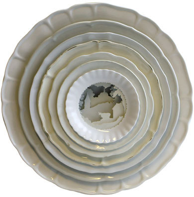
These works are reworked second hand objects. I love the idea of upcycling, and I think she has pulled it off very well. These works are so beautiful. The depth created by cutting away parts of the plate and layering is so interesting, and I love that the function of the object is compromised by this process. I also love the color palette she sticks to, and I bet it would be a lot of fun to watch her process...acquiring the plates through hand me downs, thrift stores or estate sales, and then to see how she creates such a precise and smooth line. Fascinating!!

http://www.carolineslotte.com/works/works_2003_2006/8.html

Rebecca Wilson


These are from her series Finest Paperware. This work questions our throwaway culture. She builds this with cast sheets of specially formulated paperclay. These works are a derivative of traditional ceramics, "the ‘Jasperware’ version emulates Wedgewood’s iconic range using stained porcelain slip and embossed relief details in white. And the Dutch classic ‘Blue Delft’ is alluded to in digital decals scanned from hand drawn decals in blue biro." These really do look like paper cups, yet are much more beautiful and engaging. Maybe it's the gold varnish?

http://www.designboom.com/weblog/cat/10/view/15526/rebecca-wilson-finest-paperware.html

Bean Finneran

Drawing on aluminum black on white 1, 2010
gesso on aluminum panel
20" x 20"
 
Drawing on paper 1, 2010
paper, pencil and acrylic
23.75" x 31.75"
Incidence and Pattern, 2010


Bean Finneran's work is awesome!Finneran was born in Cleveland, Ohio in 1947. She is very well educated, she has studied at Goucher College, University of Michigan, Museum School, Boston Museum of Fine Arts, and the Massachusetts College of Art.She has had many solo shows and group exhibitions. I love the movement the lines create in her work, and the way that her clay and two dimensional work correlate so well together.

http://pdxcontemporaryart.com/finneran